 Biostatistics for the Clinician
Biostatistics for the Clinician
Biostatistics for the Clinician

Biostatistics for the Clinician
| Figure 13.3 Scatterplots |
|---|
|
|
|
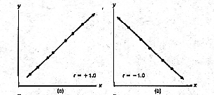
Let's assume that in the graph the variable X on the horizontal axis represents a mother's weight, and that the variable Y graphed on the Y axis represents the birth weight of the mother's infant. If the two variables increase together and are perfectly correlated, all points in the scatterplot fall on a rising straight line, as you see in the upper left graph of Figure 13.3. In this case the correlation coefficient is a plus 1 . If they are perfectly correlated and as one variable increases the other decreases, the points lie on a falling straight line, as you see in the upper right graph of Figure 13.3. In this case the correlation is a minus 1.
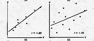
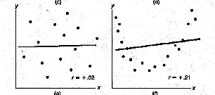
In the middle left graph you see a little bit of a scatter about the line. The correlation coefficient here is .93. In the middle right graph you see more scatter and the correlation is about .49. In the lower left graph you see much more scatter and the correlation coefficient is about .02. In general, the correlation coefficient varies from +1 to -1 with 0 indicating no relationship between the variables.
The presence of a correlation means, given an X value on the horizontal axis, you can make a prediction of the Y value by using the straight line predictors you see in the graphs. The better the correlation, the more acccurate the prediction. The correlation coefficient just measures the degree to which the scatterplots for the variables approximate the straight lines.